HBO’s dense Game of Thrones series can be hard to keep track of. The first season started with some hefty exposition, followed by less-hefty sexposition, and then dozens of deaths. There are made-up languages and intense power struggles and incest and armor and hair-braiding and oh boy. But as we ready for Season 2 (which premieres Sunday), Vulture is ready to lay it out for you in clear, concise, mathematical form: Here’s Game of Thrones’ first season, strictly by the numbers — the number of bare breasts and murders per episode, the demographic breakdown of its fandom (Lord of the Rings fans vs. Harry Potter fans vs. poli-sci majors), and much more. How do you say “fun with pie charts” in Dothraki?
Nudity Per Episode by Body Part

Sex Scenes Per Family
* Single love scene between Cersei and Jaime gets two points (one per family member) owing to incest loophole.
Breakdown of Major Cast by Country of Origin
Visible Onscreen Kills Per Episode*
* Note on methodology: Numbers only include murders seen visibly performed during show. Stabbings, beheadings, disembowelings, and battle slaughter that occur off-screen not included in tally.
Game of Thrones Viewer Demographic
Amount of Game of Thrones Viewers' Hearts Broken by Each Death
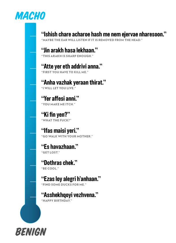
Dothraki Phrasebook Fever Chart
Source: dothraki.org