
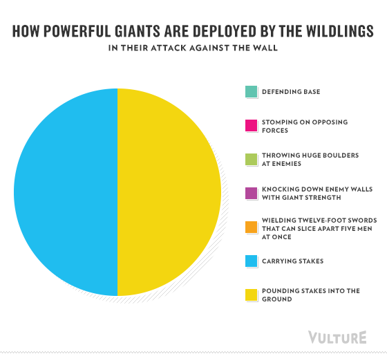
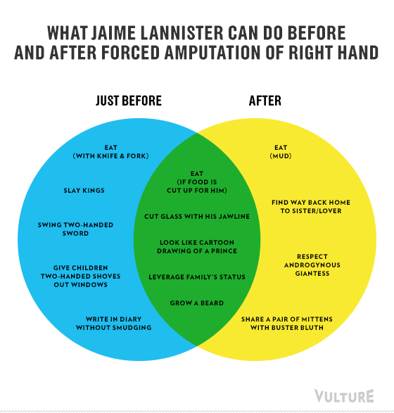
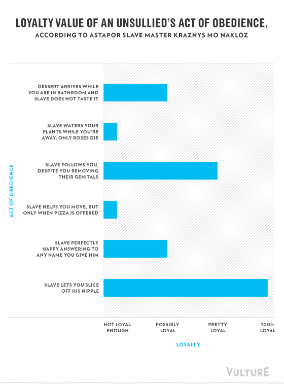
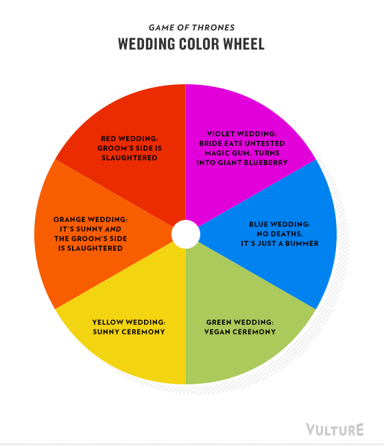
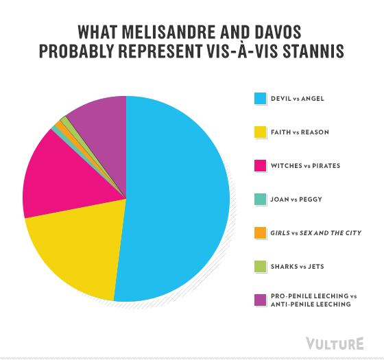
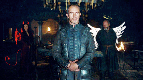
Game of Thrones season three ended just five days ago and we’ve spent the entire time since missing, thinking about, and analyzing it. And is there a better way of looking back than in graph and chart form? Nope! So that’s exactly what we did. We broke down the Unsullied’s signs of loyalty, the meaning of Westeros wedding colors, what Davos and Melisandre symbolize in relation to Stannis, and more. So take a walk down GoT memory lane, stop at a bar (graph), and eat some pie (charts).


