
There are plenty of things to like about Netflix’s spooky ’80s romp Stranger Things, from the normcore style to the inspired advertising for Eggo waffles. But it’s the opening title sequence that is clearly the window into its soul. Created by a talented team over at Imaginary Forces, the sequence didn’t come easily, despite the fact that they had the finalized music choice already on hand. In fact, it took months to complete it from start to finish.
“When the Duffer Brothers approached us, they definitely had a very strong vision,” Michelle Dougherty, Imaginary Forces’ creative director, explained. “They had referenced Robert Greenberg, who did a lot of title sequences for the old classics — like Mad Max and The Dead Zone. They used Greenberg to set the mood.” With this inspiration in mind, the team began creating mock-ups that were described as “a bit more modern” than a bona fide ’80s aesthetic. “We were like, Okay, this takes place in the ’80s, but it’s today’s take on the ’80s. We hadn’t seen any footage yet, because they weren’t even filming at this point,” Dougherty continued. “So the Duffers came back to us and encouraged us to look at Stephen King book covers. When you look at those covers, they have a definite feel with the typography. It’s a little bigger and clunkier and it screams ’80s.”
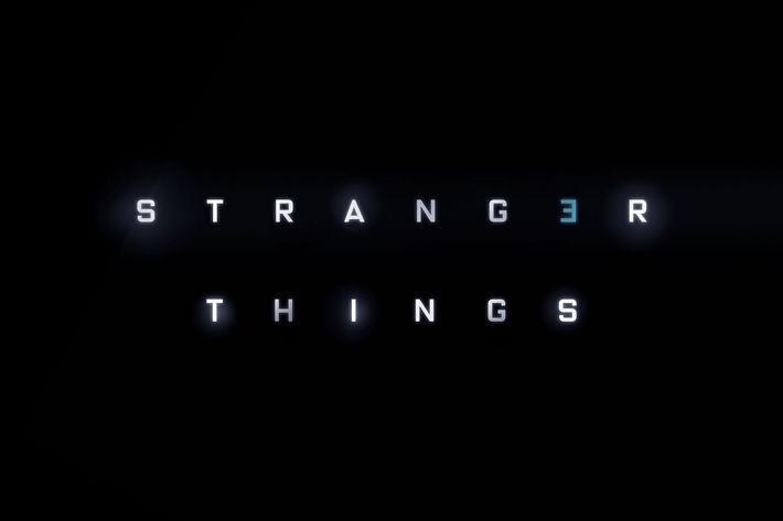
With this slightly changed aesthetic, Eric Demeusy, the lead animator and designer for the sequence, began to do new and improved mock-ups. The duo agreed — they wanted the result to be “mysterious” and something that could genuinely be mistaken for being created in the ’80s, in addition to wanting it to look slightly “imperfect” to enhance the throwback feel. “At that point, the design frames were just all of these letters floating into space. We didn’t know what the actual sequence was going to look like,” he explained. “They referenced the Pulp Fiction title sequence, which is one long pullout on the screen. That’s where we ended up going … we were trying to go for a practical, optical look.” That look, also known as “kinetic typography,” meant that the letters would be constantly moving around as opposed to remaining stagnant on the screen.
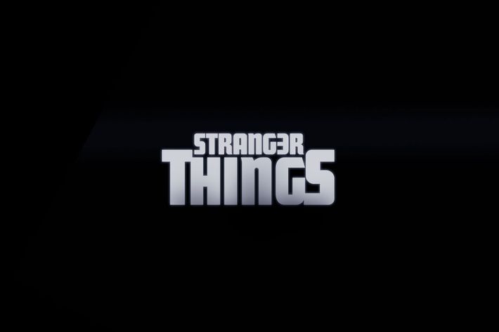
After a few more tests, a general font and typeface were finally solidified, and they sent their prototypes to the Duffers and Netflix to scrutinize. “They came back to us and were like, Actually, we’ve been using this font internally that we really like,” Dougherty said. “Which we later found out was this font created by a designer named Jacob Boghosian.” Essentially, Boghosian had taken Benguiat, which is the typeface created by Ed Benguiat, and altered it a little bit to fit his personal stylistic preferences. “He made this beautiful curvature where the letters are kind of hugging each other,” Dougherty continued. “What we did was take what he created and made the ‘S’ and the ‘R’ larger, and we created those on the top and bottom, which we had in our original layout with the other typeface.” Imaginary Forces also outlined the letters in red, as opposed to the monochromatic look Netflix had favored, and added the bars that pan out in the sequence’s final few moments. However, red wasn’t the only color the duo seriously considered.
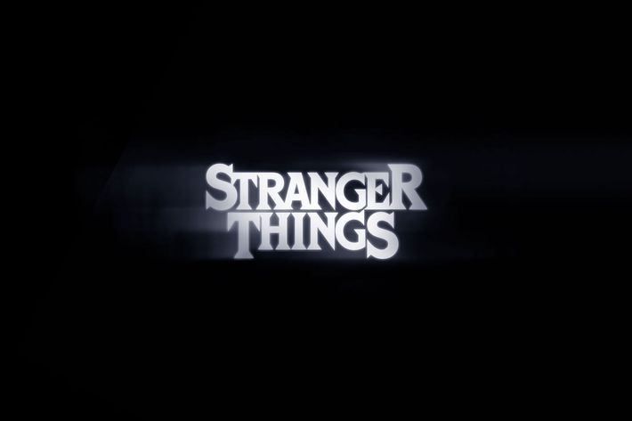
“I remember feeling, Okay, we’re kind of in this blue world,” Dougherty said. “But I really love the color red. There’s something about it that calls the attention. It also make your heart palpitate a little bit. We thought it was really appropriate. It’s funny because I recently heard a podcast with the composers who created the music [Austin-based band Survive] and they said they actually put a heartbeat in the music. It was interesting because the red makes your heart palpitate, and the heartbeat was the base of that music. So the two work really well together.” And voilà, the sequence we know and love was born.
As for season two, the duo thought about tweaking the sequence, but agreed in the end to alter nothing besides an added “2.” “We did explore other colors, but they just weren’t as good,” Dougherty admitted. “We’d seen at that point that people really loved the sequence, so what was the point?” Besides, as Demeusy put it, the sequence only added to Stranger Things’ overall mystery: “It started to feel like these words were like puzzle pieces. They were searching for this kid, Will Byers, and each letter was a clue, and everything was coming together.”