
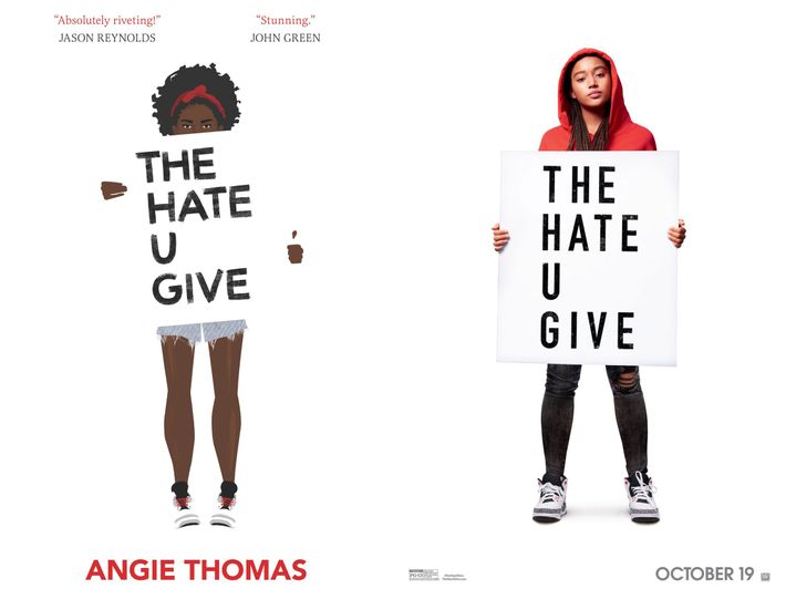
The cover for Angie Thomas’s acclaimed Black Lives Matter–inspired novel, The Hate U Give, began, fittingly, as a piece of protest art. Back in 2015, Debra Cartwright, the artist who made the illustration, was sitting at her desk at People magazine in Times Square while a protest over the death of Freddie Gray took place on the street below. Unable to knock off work to join in, Cartwright did the next best thing: She sketched an illustration on Photoshop of a woman holding up a protest sign. Only her puff of curly hair is visible above the edge of a poster with the words “End Police Terror.” The piece went viral, and eventually, Angie Thomas saw it on Instagram and suggested it to her publisher as cover material. Last week, the official poster for the movie adaptation, due out in October, was released online; the poster is closely modeled on Cartwright’s work.
Vulture caught up with Cartwright to chat about her inspiration for the cover, why she sees her work as propaganda, and how she feels about the controversy surrounding the fact that the actress selected to play the lead in The Hate U Give has paler skin than the illustration Cartwright designed.
I’d love to hear more about how you came up with the original image that the cover is based on.
The protest was going on below. I remember I put as my caption on Instagram “scared to have a kid one day,” because the original illustration has a woman and a little boy. I was really just feeling the humanity surrounding the protest and wanting to connect with what was going on down below, and feeling a little overwhelmed with all of the police brutality and the death. Freddie Gray looked like he could be my uncle or my cousin, and I wanted to do something that showed solidarity.
How did things develop from there?
That illustration spread, a lot of people re-posted it, and Angie Thomas saw it on Instagram and presented it to Jenna Stempel-Lobell [Stempel-Lobell is a senior designer at HarperCollins Children’s Books], and she really liked that format for the book cover.
It was the first book cover I’d ever done, so I was really excited. Then they sent over a PDF of the manuscript. I carried around my iPad for two weeks and my friends were like, “You’re not done with this book yet? It’s a young-adult book, you should be done.” I was like, ‘I’m done but it’s so good, I keep going back.” The character is so lovable and so different from the protagonists of the books I grew up reading.
What kind of books did you grow up reading?
The YA books I grew up reading did not have black people on the covers. Now I’m seeing a ton of illustrated black people on the covers of YA when I go into bookstores. When I was going through, the only black people I saw on covers were either really hood books, which is terrible to say, or slavery books. I was sitting there reading Gossip Girl, which I had no business reading at the time.
Tell me a little bit about the creative process. Did you know exactly what you were going to do with this cover once you got the assignment? Did you play around with alternate versions?
It’s funny because I’m working on another book cover now, and there are so many ideas that we’ve gone through, but for this particular one, it was: I want this illustration, this woman, turned into the protagonist of the book. Just use Angie’s description and create Starr [the protagonist], and put the Jordans on her feet. I’ve never done Jordans — that was the most intricate part of it. I had to go in and create these details. Angie was like, “I need my Jordans to be on point.” It was really fun though. It was the easiest turnaround I’ve ever done in a project.
In the original, the poster covers the woman’s eyes. Why did you decide to add eyes for the cover of the book?
In most of my illustrations, I’ve used white space to hide the head, mainly so people can be like, “That’s me.” If you don’t see the facial expressions, you can put yourself in it a lot easier. I just wanted everyone to be able to relate to it. For the book cover, though, they told me, “We need you to add eyes.” I didn’t want eyes on it, but it has eyes on it. That was the art direction.
They were right, really. The eyes make her more of a character. This is the actual girl, you’re going to learn about her story.
How did you decide what expression to give her?
I didn’t want her eyes angry or worried. That was a conversation. We discussed that. I wanted them to be pretty straightforward, a little passive, because I feel like — and this is funny, because it’s happening with my new book cover, too — they wanted something more angry and aggressive, and I feel like black women have had that stereotype way too much already. I never make people who are angry or aggressive. This is just a direct message Starr is trying to say. There’s no anger or force behind it, she’s just like, “Get it together, this is the change we need.” Her eyes are direct, but solemn. Not any type of hate in them.
How did you decide what she looked like?
I literally just followed exactly what they said in the book. It’s really funny because when I just did the deal with Fox, they needed to have a derivative because the actual actress looks so different from the description in the book. They changed it up a bit.
I wanted to ask you about that. Some people were upset because Amandla Stenberg, the actress playing Starr, is mixed race and has a lighter complexion than the character in the book. What do you think about the casting choice, and the conversation around it?
I wasn’t exactly thrilled, because of the colorism in Hollywood and everything. I was hoping it would be a very brown-skinned actress, because there’s so little opportunities in these big movies for darker-skinned actresses. I can’t fudge. That’s how I felt. And the fact that Fox was like, “We’re going to have to lighten your illustration, we’re going to have to change the hair.” In the movie, the illustration fades into the character, and I gave them the rights to change the illustration. It’s kind of a bummer.
Tell me more.
It’s disheartening, because I do feel like so much money was thrown behind the movie, and so much marketing was thrown behind it, and it’s just like, you can tell who Hollywood is pushing to be in the limelight, and everybody knows it has a lot to do with appearance, but it also is still being driven a bit by colorism. Not a bit. It is.
I obviously still think it’s going to be a wonderful movie, because I think Amandla Stenberg’s a great actress, but I also think there are plenty of other actresses who would be wonderful in this role as well. It was a very specific description in the book, and to see that the actress is not that description, that would annoy me as a reader, especially if I was a teen. If I saw that, as a teen, it would be very disheartening, a little damaging.
There’s a long history within young-adult publishing of publishers whitewashing book covers, or putting light-skinned illustrations of characters on the covers of books about dark-skinned protagonists. Were you thinking about that when you were working on your illustration of Starr?
Sure. I think most of my work has centered on colorism and beauty standards and representations of black women, so that fit in well with what they were trying to do with the book cover. I wish they had stuck to that idea when they were turning it into the movie, but that’s out of my control.
Was designing book covers something you’d always wanted to do?
[Laughs.] No. Actually, in design school at Parsons I took a book-cover design class, and my teacher must be cracking up, because he told me, “I don’t know if this is for you.”
How come?
A lot of book covers are really conceptual, and my teacher, who is an art director at Penguin, would be like, “You have to go deeper, think more, think outside the box.” And I’d argue that it didn’t have to be that deep. I feel like it should be very simple, straightforward, to the point. And then you can read into it what you like. You don’t want the reader to see the book and conceptualize where you were coming from with the cover, you want them to just be drawn to the cover and think, “That’s gorgeous, I’m buying that.” That was what I’d always argue. Now we’re good, but I don’t think I was his favorite student at the time. He’s probably very surprised that my illustration made it as a book cover.
In that class, did you ever talk about the possibility of using protest art as cover design?
Absolutely not. This was ten years ago. The class I took was more like, the character feels trapped as a protagonist, so we should do a series of boxes because his mind feels trapped. [Laughs.] Okay, sure. It was so conceptual. And the books we read and created covers for, I didn’t relate very well to them, either. Social media wasn’t big when I was at Parsons. I don’t think it was even thought of that there would be protest art as a book cover. We talked about protest art in the history of design, but we weren’t really thinking about it as applicable to right now. We talked about Russian Constructivism, Lenin, propaganda and protest art, which mirror each other. This really influenced what I do.
Do you think of the cover you designed for The Hate U Give to be propaganda?
Yes. Because I think propaganda is anything that’s stating your opinion, or your stance of something, or if it’s inciting some type of unhappiness with the status quo. As you probably know, the book was banned from certain schools and libraries in South Carolina, which I’m like — yes! Good work. That means it’s doing something.