The comics industry owes a debt of gratitude to Fiona Staples. The artist joined up with famed writer Brian K. Vaughan in the early part of this decade to create one of the most effective gateway drugs for comics novices ever printed: the ongoing Image Comics series Saga. Vaughan is the first to admit that this sci-fi/fantasy epic relies heavily on the arresting visuals of Staples, especially her covers and the astounding first pages she produces for every issue. The ninth collected volume of the story was released earlier this month, and we got in touch with Staples to talk about the series’ origins. Not only did she open up with us, she was also kind enough to provide us with sketches for that first issue and an early version of the first page, which we named as one of the 100 most influential comics pages in North American history. You can read our written conversation and see the artwork below.
How did you and Brian first encounter one another, and how did that lead to the creation of Saga?
Brian had seen some of my previous work, and just emailed me one day in 2011 when he was ready to pitch Saga! We’d never met before, but it immediately felt like an easy and exciting partnership.
What were your guiding philosophies in coming up with the character designs and overall visual feel for the series?
The world of Saga is about as broad as reality itself, so pretty much anything goes. Alongside the rocket ships and magic swords, there are smartphones and ATMs. My approach is to keep everything vaguely based in reality, so when we have a new planet or creature they’re usually inspired by animals and earthly locations. Brian first conceived this universe when he was a school-aged kid, so I want to keep that feeling of humor and whimsy.
How long did it take you to hammer out what you wanted Saga to look like?
I spent a little while doing concept art before getting the script for No. 1, but once we jumped in, there was no longer time to do much preliminary work! Almost everything since then has just been designed on the page.

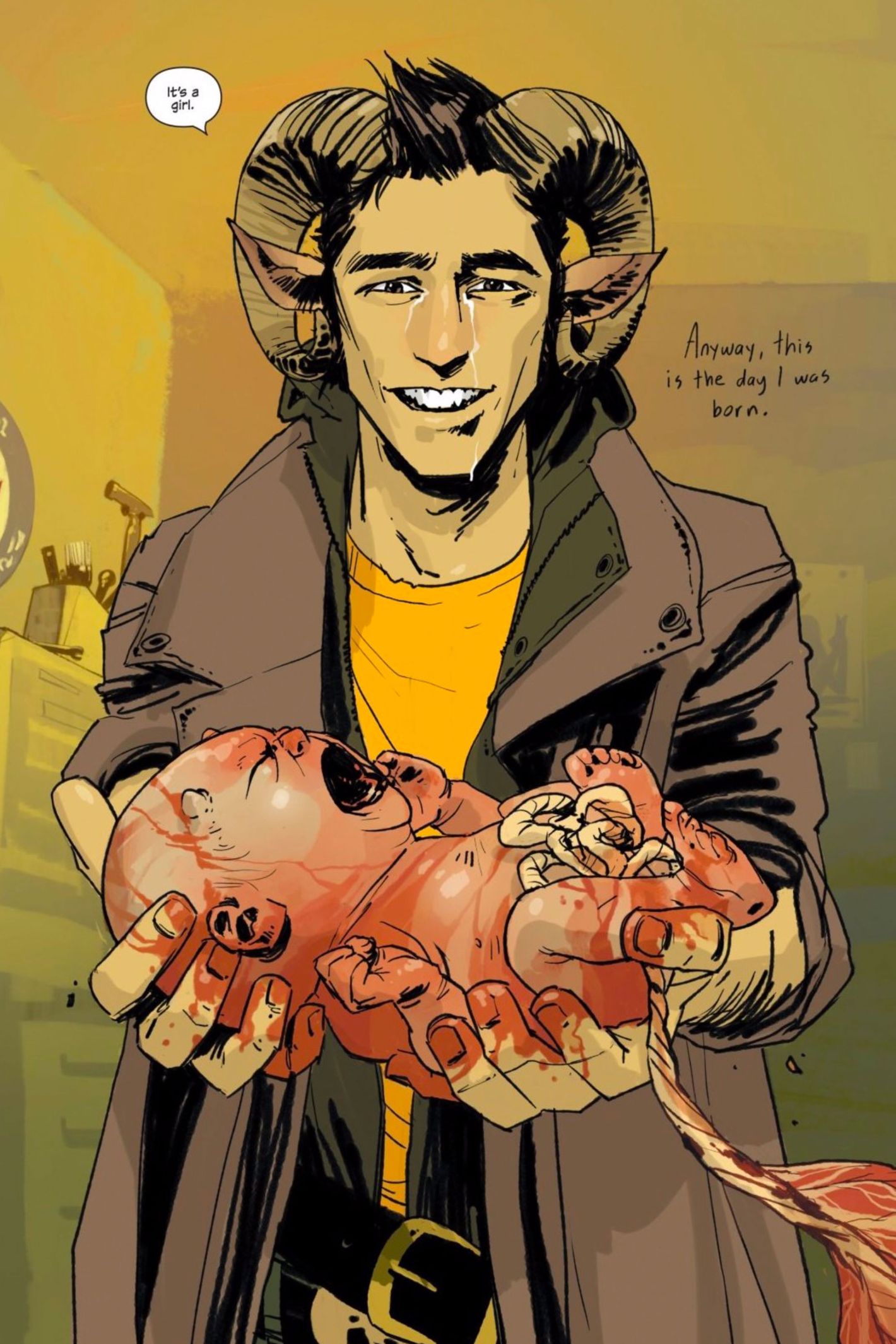
Do you remember what the script’s description of that first page was?
I don’t need to remember because I can paste it right here!
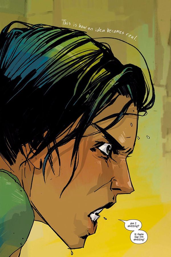
Page One, SPLASH
We open tight on a PROFILE SHOT of the right side of a panicked young woman’s face. We’re so close that her head fills almost the entire page.
This is ALANA, our heroine. She’s probably only in her early 20s, but her face is world- weary. She’s seen a hell of a lot in her years. Right now, Alana is SWEATING profusely; her face is slick. Her short-cropped, multi-colored hair is even more of a mess than usual. At the moment, Alana is a little heavier than she normally likes to be, but it lends a friendly softness to her face.
At first glance, Alana might appear to be an attractive human woman… but eventually, you notice the STRANGE THINGS jutting out from between her shoulder blades, strange things we can see only a glimpse of in this close-up. More on them shortly.
For now, all that matters is the fact that Alana seems terribly WORRIED about something. Her expression should be a mixture of horror and embarrassment.
1) Handwritten Narration: This is how an idea becomes real.
2) Alana: Am I shitting?
3) Alana: It feels like I’m shitting!
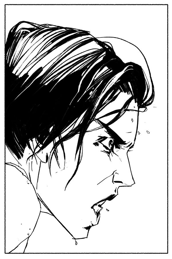
What did you physically use to draw that first page? What was your work space like?
I used an iMac and a Cintiq tablet, and my work space was a table in my old apartment. Digital art doesn’t demand a lot of space.
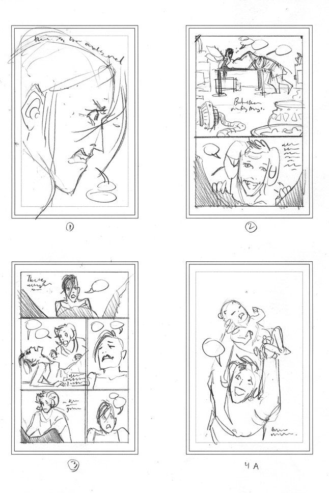
How did you approach drawing that first page? Did you model it on anything? Were there lots of drafts?
Just the one thumbnail sketch! This was an important page, being our opening, but it was also one out of 44 in our oversized first issue. I was more worried about tackling the space garage and big fight scene that the next few pages held.

How arduous a process was it to draw the first issue?
It was pretty slow going because we were seeing all the characters, tech, and settings for the first time, so they all had to be designed. I remember being worried that I’d make a poor design choice and be stuck drawing something I hated for another 20 issues.
Was it your decision to hand-letter Hazel’s narration? And is that just your normal handwriting style, or something you concocted for the comic?
That was Brian’s suggestion, and it is my naturally childlike handwriting!
How do you think your overall style has evolved since the first issue?
I think my inking has gotten a bit more refined, and the angles on people a bit softer. I’ve added new painting programs and brushes to my digital art arsenal, and generally improved my workflow to get a more polished-looking page in the same amount of time.
Do you ever revisit the first issue? If so, what do you think of it? Or learn from it?
I often have to look through old issues for reference, and it’s always slightly hard on the eyes! If anything, I’ve learned that it’s okay for the look of the comic to evolve over time, and if I want to make any stylistic changes to improve the art, probably no one will notice or care. My fear of being nailed down to a bad design decision that I made years ago was for nothing. It’s never too late to fix stuff.