Halloween’s a memory, but Ti West’s The House of the Devil — which David Edelstein, writing on The Projectionist, recommends as an “ode to seventies gothic, female-oriented horror films in which less is more” — keeps chugging away at the Angelika. In August, Vulture debuted the movie’s pitch-perfect first poster; recently, Magnolia Pictures released four more web-only posters, all designed by Kellerhouse, Inc.’s Neil Kellerhouse. Best known for design work on lavish boxed sets for the Criterion Collection and the films of Steven Soderbergh, the small design house has become a go-to firm for the lost art of thoughtful, sometimes challenging poster work. “You could have a whole career in horror [design work],” Kellerhouse told us from his studio in Los Angeles. It’s a really unique genre. People are fanatical, they really know their stuff.” Read what he had to say about the inspiration behind the five House of the Devil posters.
“This came directly from the filmmakers. They sent a whole bunch of posters over, some classic, some kitschy, including
Rosemary’s Baby,
The Exorcist, and some other horror films. They even had
Flashdance in there. They had very specific ideas about what they wanted the poster to look like. That particular poster is based on
The Boogey Man, where she’s standing in the window.”
“The only thing that was changed from the original poster presentation was making the word “die” bold and red. That’s unheard of in the film business. The absurd taglines on the poster are a part of the genre. I thought, We have to come up with an insane tagline. We were bantering back and forth: ‘Strap on the mom jeans and die.’ ‘Having Satan’s baby.’ ‘$400 a night, she’s making a killing.’ Just totally over-the-top dramatic. So we just said, what’s the movie about? She comes home, she watches TV, she does her homework. And then she dies. It worked perfectly.”
“The folds came directly from buying all these vintage posters. I was really into the sexploitation stuff, like Russ Meyer. But as designers, we’re always looking for obscure stuff. If it was up to us, it would look totally different all the time. But audiences won’t react to it if it’s not somehow familiar”
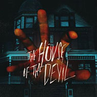
“The other four posters were in the original presentation. They help people get their bearings with new visual interpretations of the film. [The hand] was just another absurd image. The poster from
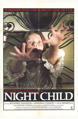
Night Child was a direct influence. It was just meant to show the power in the house. In fact, I was working with someone who said, ‘Don’t show that one, man!’ That was brought in just to swing the pendulum and show how avant-garde we could get — but they picked it.”
“This is an interesting one because of the way it’s cropped. If you just had that image cropped like that with no type on it, it’d be a real removal from what you’ve seen in the past. And that’s unsettling. But that’s not what Ti [West] is after. He’s not trying to make you have nightmares for the rest of your life. He wants to entertain you. It’s all steeped in tradition, the film and the poster.”


![“The other four posters were in the original presentation. They help people get their bearings with new visual interpretations of the film. [The hand] was just another absurd image. The poster from Night Child was a direct influence. It was just meant to show the power in the house. In fact, I was working with someone who said, ‘Don’t show that one, man!’ That was brought in just to swing the pendulum and show how avant-garde we could get — but they picked it.”](https://pyxis.nymag.com/v1/imgs/b27/106/01af775f4e2af735cbc3060216ce84a803-20091106-hod-hand-378x560.2x.rhorizontal.w700.jpg)
![“This is an interesting one because of the way it’s cropped. If you just had that image cropped like that with no type on it, it’d be a real removal from what you’ve seen in the past. And that’s unsettling. But that’s not what Ti [West] is after. He’s not trying to make you have nightmares for the rest of your life. He wants to entertain you. It’s all steeped in tradition, the film and the poster.”](https://pyxis.nymag.com/v1/imgs/a8a/d1b/df74cd4ab429684508ef741256860245e5-20091106-hod-tear-378x560.2x.rhorizontal.w700.jpg)


