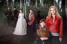
Amid the hubbub of upfronts and the excitement of new shows getting picked up (plus the delicious Schadenfreude of shows not getting picked up), one major thing often gets overlooked: the bizarrely crappy key art the networks release for their new shows. Some of the art is fine — banal, overly posed and edited, but fine — but some of these photos are just ridiculous. Particularly the one for Once Upon a Time:
ABC! Come on, now. That image of the national security team wearing Princess Beatrice’s hat looks better than this.
Pan Am

Chrsitina Ricci levitating between those two pilots is pretty creepy.
Bent

Why is David Walton so gigantic? And tan?
Free Agents
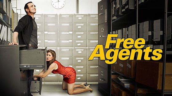
Really? Implied blowies on a poster? We’re there now?