

There’s a cohort of television shows that are way too dark. Not necessarily in terms of thematics or subject matter (although they often go hand in hand) — just, visually, so dark that it’s hard to even see the image. These are the kinds of shows that you try to watch on your fair-to-middling laptop screen in the middle of the day and find yourself straining to see what’s going on; shows where even on your giant flat-screen, you find yourself making sure all of your lights are off so that you can distinguish people’s bodies from one another. And it is probably not a coincidence that the sorts of shows that suffer from this problem are almost never comedies.
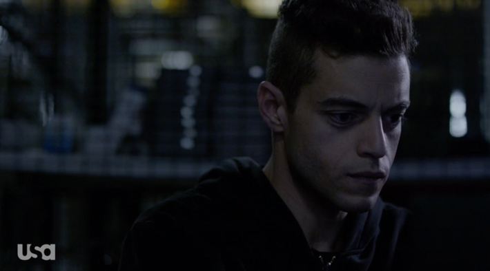
It’s easy to look at two series like Mr. Robot and Jane the Virgin and find lots of reasons for the differences in their color palettes. Mr. Robot takes place in New York; Jane the Virgin is set in Miami. Mr. Robot is a show about a guy who sits in front of his computer a lot, and plans to take down the world. Jane the Virgin is a show about a young woman navigating her very complex love life, and trying to balance her role as a mother with her nascent career. Jane is “light,” a show full of optimism and positivity, and Mr. Robot is “dark,” so the colors mirror those perspectives.
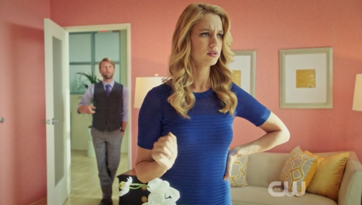
The underlying implication built into those two poles, though, is that Mr. Robot is “serious” (and all of the accompanying prestige-y, artistically important things that label implies), while Jane is not. Which is absurd, of course. There’s no inherent reason why Jane’s content should be considered less “serious,” and indeed, Jane is one of the most sneakily political, passionately argued shows around. But Jane is also funny. And so it’s also sunnily splashed all over with high-contrast, saturated colors, like a gloriously technicolor Rogers and Hammerstein musical. Mr. Robot, meanwhile, looks like someone has perpetually forgotten to turn on a lamp somewhere.
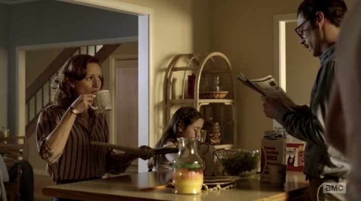
Still, there are lots of complicating variables in those two examples. The setting alone is reason enough why the colors might be so radically different. So let’s try to compare something more apples to apples. Take Halt and Catch Fire, a show that’s recently shifted its setting from Texas to Silicon Valley. Two episodes into its third season, Halt and Catch Fire’s Bay Area is the darkest, gloomiest California imaginable. Mutiny, Donna and Cameron’s internet start-up company, seems to hold all of its working hours at night, or in a large, industrial office space that inexplicably has no windows. Donna and Gordon’s home is marginally brighter, but even their morning breakfast scene looks weirdly gloomy.
Compare that image with HBO’s Silicon Valley, a series that takes place in the same geographical place, with people who do the same jobs, in the same competitive start-up culture. The difference is remarkable. Silicon Valley’s California is full of saturated colors and bright sun. Even nighttime conference rooms feel warm and well-lit.
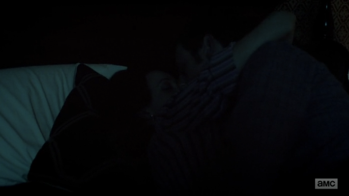
Here, the difference is clearly tonal. Silicon Valley is a comedy, Halt and Catch Fire is a drama. And HACF signals its seriousness with literal darkness, even though the subject matter is nothing like the apocalyptic murk of Mr. Robot. But because it’s about “serious” innovation, Donna and Gordon have sex in near blackness, and Mutiny looks like its offices are in a cave.
(Even when it escapes the computer world, HACF is still relentlessly dim. A scene at an elementary school in the middle of the day looks like it could be taking place during a blackout.)
It’s hard to say whether TV drama has always been this way. TVs used to be 20-inch cathode-ray tubes that had all the crystal clarity of a bad glasses prescription, and color was something you could adjust with a knob on the side. Homicide: Life on the Streets is a pretty dark series, visually and otherwise, but it feels unfair to compare that series’ visual style with a show made to display on retina displays and massive flat-screens. And certainly, this concept of “prestige” TV, and its accompanying shadowy solemnity, is an invention of the past 20 years. The color possibilities for TV dramas are now endless. Why does it too often feel like we’re Dorothy and we’ve woken up in Oz, only to find that the yellow brick road looks beige at best?
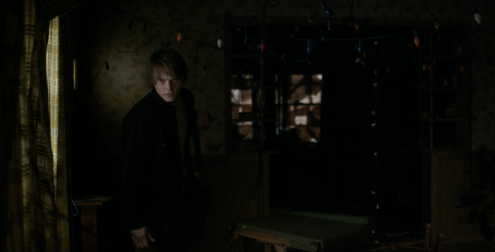
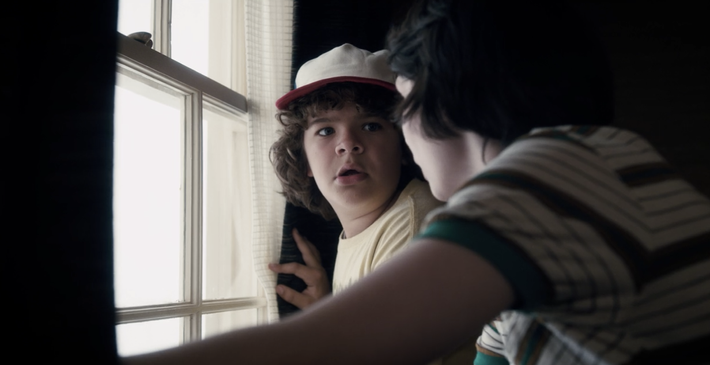
It doesn’t have to be this way. Mad Men, a show synonymous with prestige and seriousness, was awash in brilliant color. While Breaking Bad certainly had its dark scenes, it also used color to gorgeous, useful storytelling effect. Stranger Things, a series with every genre-related reason in the world to be creepily dark, often is. But it’s much better at telling stories easily distinguishable by color, so that the monster-plagued Byers house is constantly shadowy…
…and Mike’s home, a bastion of safety, is far brighter.
Or there are series like Narcos, which follows the Difficult Criminal Man arc that’s become so familiar to us from the last decade and a half. It could easily fall into that same dim color palette to signal how serious and important it is, but it’s often stunningly bright, lit by yellows and oranges that deepen and reinforce the show’s insouciant, distantly wry tone. Compared with that saturated goldenrod palette, any given episode of the otherwise genius The Americans is bound to look murky.
Not all TV needs to be bright all the time. Periods of darkness are vital visual tools, which do so much to create mood and delineate space and time. When an entire episode of Jessica Jones is filmed in unrelenting noir shadows, though, and when Ray Donovan’s perpetual sepia gets too boring, and every non-Daenerys scene of GOT looks like it’s been stained with coffee, the effect is lost.
So-called “serious” TV has so many tools to communicate complexity and bleakness — there are characters who are tough to understand, opaque stories that are hard to predict, endless layers of complication and obliqueness available to TV storytellers. There’s also a seemingly boundless permission for depictions of violence. If the goal is to make a series hard to watch, there are lots of ways to do it. It does not also need to be hard to see.