For much of the early history of the American comic book, the cover was the most important part of the finished product. During the early-1940s zenith of the so-called Golden Age of Comics, there was a market overload of the cheaply printed funnybooks, and the kids buying them were mostly uninterested in loyalty to creators or companies — so the only way you could get your book into a youngster’s grubby little hands was by popping their eyes out with a wild image on the front. Nowadays, the audience is older, smaller, and much more inclined to make their purchasing decisions based on the people and publishers who made a given issue. Nevertheless, the cover has remained a fascinating art form, one that is largely separate from the interior artwork. A cover has to set a tone and generate excitement with a static image while still honoring the spirit of the medium inside. Even great comics artists can’t always do great covers, but the ones who can are able to sear their work into a reader’s brain.
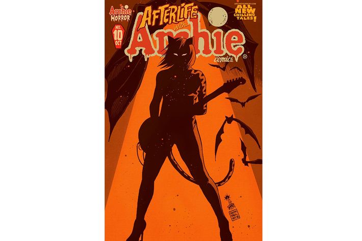
10. Afterlife With Archie No. 10, by Francesco Francavilla (Archie)
Afterlife with Archie began as a cover, so it’s only appropriate that its covers are regularly among the best in the business. When beloved Italian artist Francesco Francavilla was tasked with drawing a cover for a limited-edition variant of an issue of Life With Archie, he goofily chose to depict a zombie scene and titled it “Afterlife With Archie.” The company opted to turn that silly idea into a deathly serious series about a zombie apocalypse in Riverdale, and one of Francavilla’s best covers arrived this year. In bold silhouette, it depicts Josie and the Pussycats front lady Josie, staring ahead at something — a zombie? prey? the reader? — with blank, sinister eyes. It’s simultaneously pure horror and pure rock and roll. Notice the subtle touch of sprinkling dots of paint throughout the image, suggesting the mystery of an aged photograph or the panic of wanton bloodletting. It’s too bad the Pussycats aren’t real, because this’d be a killer concert poster.
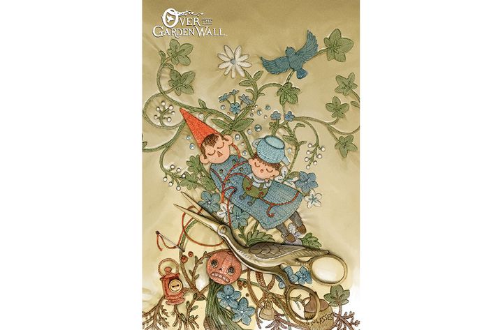
9. Over the Garden Wall No. 1 retailer appreciation variant, by Rachel Saunders (BOOM!)
Variant covers are regularly derided as crass attempts for publishers to juice their sales, and though it’s a fair criticism, they also offer something that’s all too rare in the industry: opportunities for rookie artists. If a creator isn’t necessarily experienced enough to be granted 22 pages, a company can give them a chance with a variant and see if it resonates — and boy, Rachel Saunders’s variant for the first issue of Over the Garden Wall certainly does. The series is an offshoot of a beloved Cartoon Network mini-series by Patrick McHale, but Saunders wisely chose to take her image out of the animated realm and craft something unique and evocative. By putting the main characters into a photorealistic vision of an embroidered quilt, Saunders gives subtle praise to McHale’s iconography, declaring that his character designs can stand out in a completely different visual milieu. Don’t you just wanna reach through the screen and touch it?
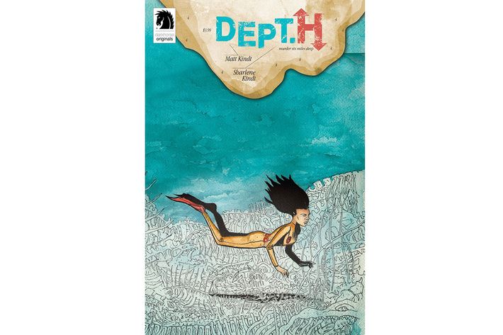
8. Dept. H No. 4, by Matt and Sharlene Kindt (Dark Horse)
In addition to being a distinctive writer and charmingly elliptical thinker, Matt Kindt is one of the better graphic designers in the comics business right now. He has idiosyncratic visual obsessions, ranging from equipment schematics to the names of his books (e.g. Dept. H is set deep underwater, and the pun only makes sense visually, not auditorily). So it’s no surprise that Kindt was able to craft one of the most exciting layouts of the year. His pencils and his wife’s watercolors (and really, shouldn’t that be the kind of colors all deep-sea stories have?) combine in an elegantly spaced image that places the protagonist’s body exactly where it needs to be in order to convey the curious levitation of underwater movement. She’s just close enough to the ocean floor (littered with ominous lines that could be bones, could be creatures, or could just be seaweed playing tricks on us) to let us know that she’s attempting to scan it, but so far below the top of the image that we feel slight anxiety about how far that journey has taken her from the safety of the surface. The shadow is a beautiful touch, and only after a few glances do you notice that she’s not wearing any kind of breathing apparatus. Something’s amiss, and our heroine is resolutely determined to figure it out in an environment that abhors her.
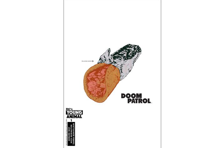
7. Doom Patrol No. 1, by Nick Derington and James Harvey (DC)
Doom Patrol is written by a rock musician, so it’s only appropriate that its debut issue is an homage to one of the all-time great rock-album covers. My Chemical Romance’s Gerard Way has launched a DC Comics imprint devoted to explorations of the stranger corners of the company’s continuity and aesthetics, and the Velvet Underground and Nico–referencing image here immediately announces that this comic won’t be like anything else on the stands. Where are the characters? What the hell’s the story? And why are we looking at a gyro? Inside, we learn the significance of the food item (much of the tale takes place at a microscopic scale inside the gyro, because reasons), but here, we just chuckle and cock our heads in curiosity at what Nick Derington and James Harvey have produced. It’s blunt and odd, and it has another virtue that you can’t understand just by looking at it here: The foil actually peels off, if you scratch at it. In an age of increasing reliance on digital media, it’s always nice to see a celebration of the uniqueness of print.
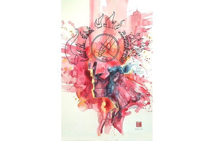
6. Hellboy and the B.P.R.D.: 1953 - Beyond the Fences No. 1 David Mack variant, by David Mack (Dark Horse)
What would a best covers list be without David Mack? The artist is one of the great masters of the medium, and decades into his career, he’s as vital and distinctive as ever. At first, the idea of Mack using his dreamlike watercolors and sketchbook lettering might not seem like a great fit for the statuesque and cartoony world of Mike Mignola’s Hellboy, but that aesthetic dissonance burns white-hot into your mind here. The strange shapes reveal the character’s supernatural aspect, far removed from the can-do frankness he tries to exude. The varying shades of red remind us both of Hellboy’s skin and the blood of his foes, friends, and self. A horn floats just a few centimeters away from the spot on his forehead where it once stood before being sawed off, and the only hardened portion of the image is his agency’s logo, overlapping into his mind but never quite overtaking it, as is thematically appropriate for this reluctant team player. The flame-alphabet words are eerie, like something out of the kabbalah — and hey, so is the guy we’re picking up the comic to read about, right?
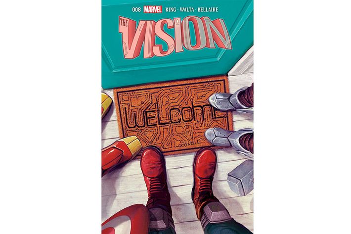
5. Vision No. 8, by Mike del Mundo (Marvel)
I’m almost tempted to do a separate list that just ranks Vision covers. The mini-series has been among the most acclaimed in recent Marvel history, and though the praise is usually lavished on writer Tom King and interior artists Gabriel Hernandez Walta and Jordie Bellaire, we should honor and linger on Mike del Mundo’s tremendous covers. They, like the stories inside, milk the juxtaposition of mundane suburban life and inhuman power-sets, and del Mundo is at his best in this decidedly un-flashy image. It tells you all you need to know in an instant: Iron Man, Captain America, and Thor have all arrived to have a chat with everyone’s favorite synthezoid. What a brilliant way to dissect iconography! Who knew that we could identify these characters just by their little toesies? A lesser artist would have just given us a shot showing their backs as they stand at the door, but here, we’re cleverly disoriented. Are we looking through Cap’s eyes, or are we an unseen observer for this tense encounter? And make no mistake, the encounter will be tense. Otherwise, why would the heroes stand in a semicircle, poised to circumscribe whoever turns the knob? The mat yells “WELCOME,” but the word drips with dramatic irony.
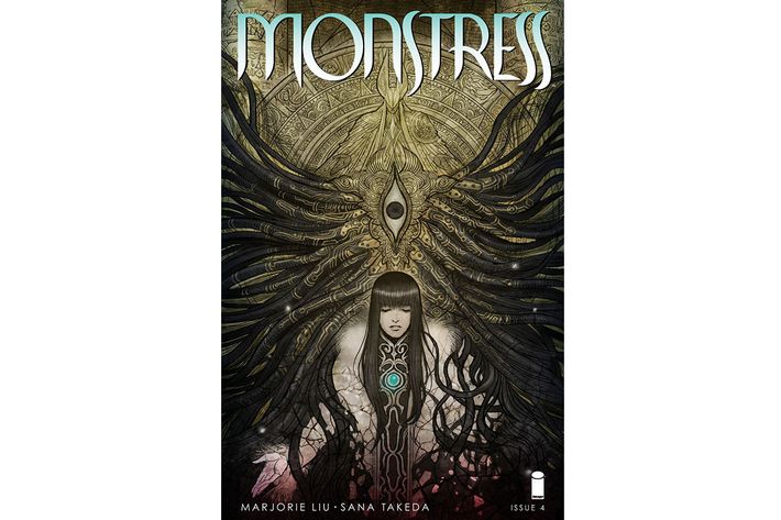
4. Monstress No. 4, by Sana Takeda (Image)
Marjorie Liu and Sana Takeda’s expansive and gripping Monstress derives much of its power from the way it weaves together disparate genres and artistic modes in an attempt to immerse you in a fully realized and wholly unique fantasy world. Takeda’s covers tell you all you need to know about that world before you even open the comic: It’s a little steampunk, a little manga, a little fantasy, and more than a little horror. The fourth issue’s front image goes especially hard on the latter genre, cooking up H.R. Giger–esque mechanical tentacles and a wide, vertical eyeball that looks like something out of a gnostic illuminated manuscript. What’s most impressive is the way Takeda balances the erratic arrangement of the tentacles with the rigid designs of the engravings, and depicts the protagonist as existing somewhere in between those two extremes. She is, as we learn inside, trapped between contexts and imperatives, and her melancholy expression perfectly encapsulates her struggle to untangle intractable dilemmas. Plus, those bangs are fantastic.
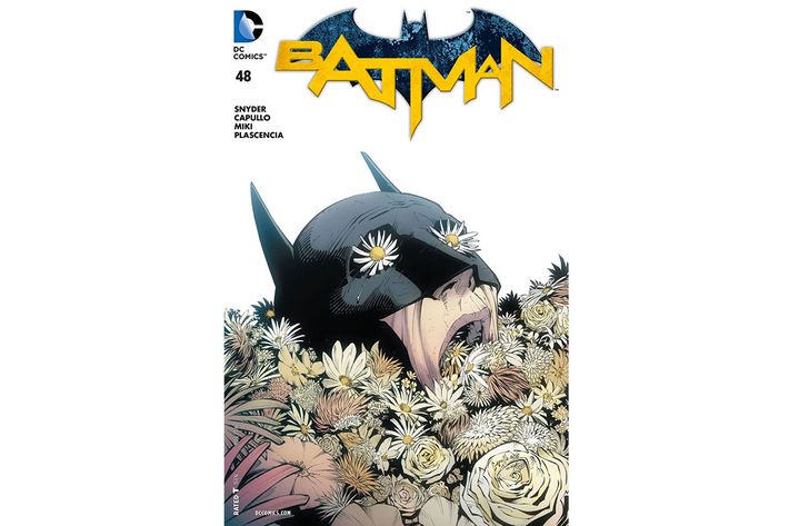
3. Batman No. 48, by Greg Capullo, Danny Miki, and Francisco Perez (DC)
It’s hard to come up with a truly new visual take on Batman. The guy’s been around for 77 freaking years, and we’ve seen him go through just about about every leap, swoop, punch, and wince imaginable. But one of the Caped Crusader’s greatest modern artists, penciler Greg Capullo, pulled off the impossible and designed a Batman image unlike any that came before it. He and writer Scott Snyder wrapped up their fantastic and beloved run on Batman with a story line involving the Dark Knight’s battle against a botanically themed baddie who goes by the nom de guerre of Mr. Bloom. This particular scene doesn’t literally occur within the comic, but it couldn’t be more aesthetically linked to the story the reader is about to experience: Batsy isn’t being outfought or outsmarted — he’s being utterly overwhelmed. Bloom’s natural weaponry is unstoppable and, chillingly enough, comprised of that most innocuous of biological items: pretty flowers. We’re seeing Jim Gordon (who’s been filling in for Bruce Wayne)* choke on them, and the bulbs and petals on his eyes throw us off: Is he still alive, or do the eye-like formations deceive us about a Bat-corpse? Is the single tear due to despair at his inability to save Gotham, or was it the watering of asphyxiation? The blank background gives no answers; it just implies a final journey into the void.
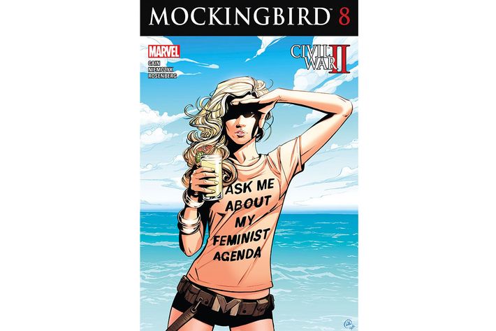
2. Mockingbird No. 8, by Joelle Jones (Marvel)
Sometimes, you don’t fully appreciate an image’s power until you see the reactions it provokes. And boy howdy, was the reaction to this sucker intense. The final issue of the prematurely canceled Mockingbird was among the most-shared images on the comics internet this year due to the misogynist backlash against it and the issue’s writer, Chelsea Cain. She was horrifically cyberbullied in late October for her outspokenly feminist viewpoint, in which Mockingbird was steeped, and the abuse became so vehement that Cain deleted her account. It was a terrible turn of events, but it did turn this already great Joelle Jones piece into the most iconic cover of the year, savaged by attackers and championed by defenders.
The core element is, of course, the idea of a superhero wearing a shirt that declares, “ASK ME ABOUT MY FEMINIST AGENDA,” and that’s no small thing. We live in a pop-culture landscape where creators across all mediums are bizarrely and frustratingly afraid to say the other F-word, but here, there is absolutely no hedging or dog-whistling. Jones and Mockingbird have had it up to here, and are tired of beating around the bush. What makes the image unique in this political tradition is how little it resembles other famed feminist pieces of cartooning. Mockingbird is no Rosie the Riveter, flexing a bicep in an attempt to show that a woman becomes powerful when she acts like a man. No, the character here is distinctively feminine and entirely chilled out. She’s showing that progressivism can — and must — involve enjoyment. She’s sexy, and her shorts evoke the look of a Bond Girl, but the character is devoid of degrading visual tropes like exaggerated breasts or the infamous “brokeback pose.” The series is ending, and Bobbi Morse has earned a vacation from her Mockingbird persona. But still she gazes ahead — are her shadowed eyes looking to a new horizon, or is she staring judgmentally at the reader? We’ll never know, but the ambiguity should unsettle us enough to wonder about our own agendas.
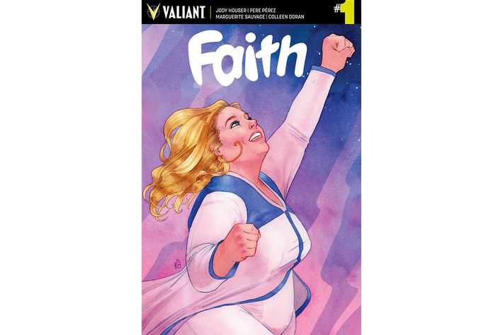
1. Faith No. 1, by Kevin Wada (Valiant)
Valiant Entertainment’s Faith is, like its heroine, utterly unashamed. It’s a series about a relentlessly optimistic and earnestly empathic superperson who rarely broods and passionately desires to improve the world around her. She also happens to be plus-size. That latter trait sets her apart from every other female lead in the superhero genre, but it doesn’t narratively define her. Instead, the revolutionary nature of her shape only comes in the form of her visual depictions, the greatest of which arrived in this masterful watercolor from the unstoppable Kevin Wada. It gives us a woman who is tremendously comfortable in her form, which, in an eternally self-loathing America, is a kind of courage in and of itself.
More important, you hardly even notice her size on a first glance — you just notice the heroism. Sure, this is a profoundly simple image, devoid of any formal risks or mind-bending trompes l’oeils. So what? One of the great virtues of the comics medium is the way it lionizes simplicity and directness. The cover of Faith No. 1 is built on those traits, grabbing you in an urgent, compassionate hug that sends a jolt of fellow feeling and inspiration to the top of your chest. This is what superheroism used to be, before we became fixated on personal failings and moral ambiguity (both of which are just fine, but overrepresented in the genre). Faith’s smile is broad but not goofy, her hair swirls in a triumphant climb through the air, the watercolors show her rise beyond Earthly coils, and her fist isn’t punching an enemy — it’s bursting past the expectations that her powers have allowed her to shatter. If there’s such a thing as superhero formalism, Wada has painted it here. It’s like a propaganda poster, if the Soviets were laying out a Five-Year Plan to build joy.
* This post has been updated to reflect that it was Jim Gordon, not Bruce Wayne, in the Batman suit on the Batman cover.