
Fans of the author Haruki Murakami crave his books for reasons that can be hard for them to articulate or even understand, much in the way that the characters in his novels inexplicably crave old jazz records and meals of plain spaghetti. His plots can be stilted, his dialogue robotic; as the writer Nathaniel Rich pointed out, “no great writer writes as many bad sentences as Murakami does.” And yet, when readers walk into a bookstore and see a freshly printed hardcover copy of one of his U.S. editions, they often find themselves moving toward it as though drawn in by the gravitational force of an obscure astronomical entity. Mostly this is because of Murakami’s writing — at once liminal and mundane, riddled with symbols and mystery. And partly it’s because of the art of Chip Kidd.
Kidd, an associate art director at Knopf, is that rare thing in the world of book design, a designer whose renown rivals that of many of the authors with whom he works. His unpredictable and iconic covers are works of art in their own right; they include the first editions for such modern classics as Jurassic Park and A Secret History. Some authors, including the late Oliver Sacks, have written into their contracts that Kidd must design their books. He has designed the covers of more than a thousand books, including all of Murakami’s hardback first editions since The Elephant Vanishes. Designing for Murakami presents unique challenges. As Sam Anderson pointed out in a 2011 New York Times Magazine profile, Murakami’s stories “are not only translated but about translation.” Kidd’s designs add yet another layer of translation. “I’m translating what I think he’s trying to get across,” Kidd told me when I visited him at his office at Knopf a few weeks ago. “In that sense, it’s very presumptuous on my part, though it would be presumptuous on any designer’s part.”
Killing Commendatore, Murakami’s new novel, out in the U.S. on October 9, relays the story of a portrait painter who, after his wife divorces him, moves to a mountaintop, where he meets a mysterious neighbor and discovers a strange painting depicting the titular Commendatore, run through with a blade. In typical Murakami fashion, the painting seems to possess strangely mystical properties. For Kidd’s first draft, which, for logistical reasons, he’d had to mock up before actually reading the text, he produced a cover depicting a blade slicing through a textured red canvas. In an email, Murakami gently prodded Kidd to rethink the design once the English translation of the book was available for him to read. This was the first time in their 25 year partnership that Murakami requested a revision. “It turned out, he was right,” Kidd said.
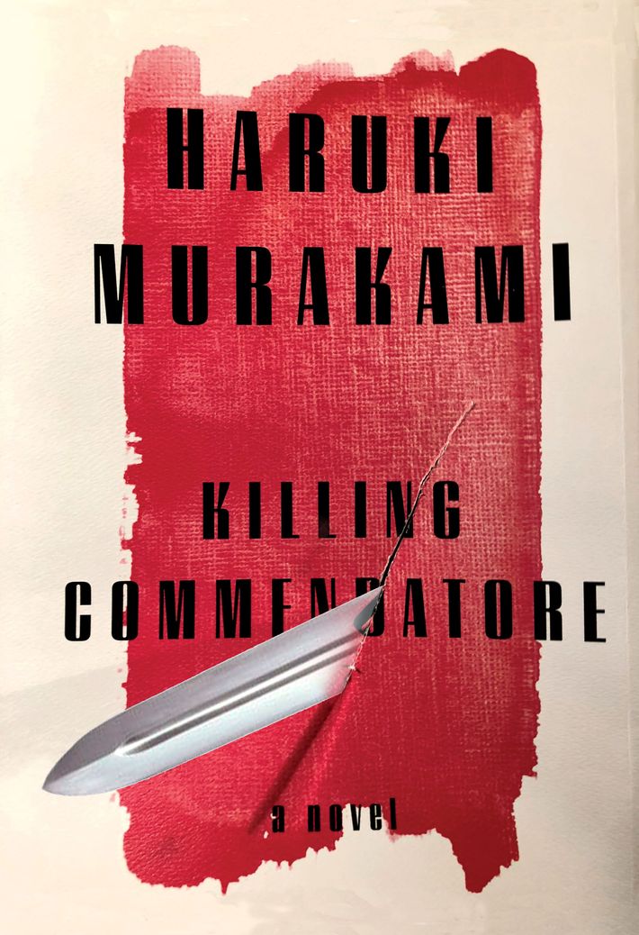
Once he’d read the book, Kidd realized that the earlier cover had the wrong feeling, as though it was advertising a straightforward murder mystery instead of the odd, eerie, and, at nearly 700 pages, epic book Murakami had written. “It was too lurid,” he explained. “It wasn’t special enough.” The final product, revealed exclusively on Vulture, appears deceptively simple: a yellow ring that could be a sun, against a blue background that could be the sky, or brush strokes on a canvas. (There’s an oblique reference in Killing Commendatore to The Great Gatsby, and both colors were inspired by the classic blue-and-yellow book cover.)
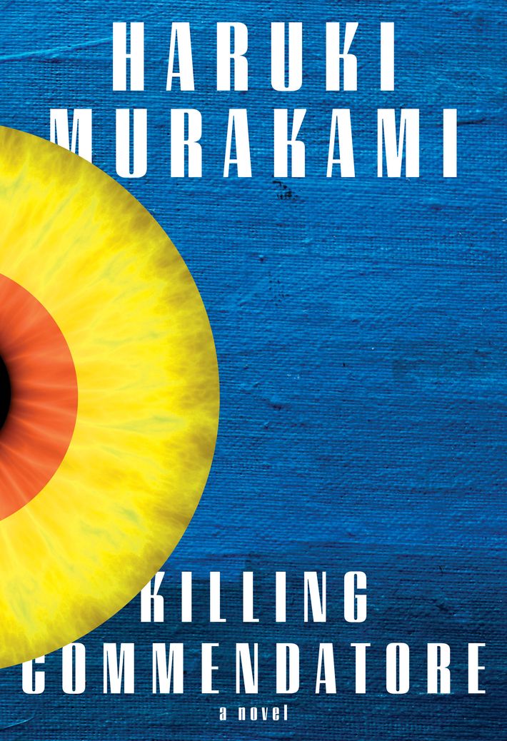
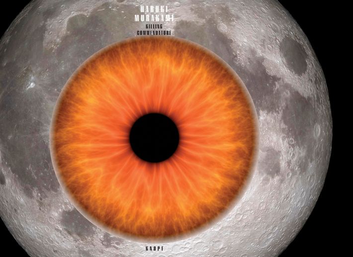
But there’s a hole in the middle of the jacket, right in the center of the sun, and when you take the jacket off, the bright blue gives way to dark night — you see that the sun is both a yellow moon and an all-seeing eye, a reference to many of Murakami’s signature themes: ambiguity and hidden messages and holes that transport you into other, more terrifying universes.
“In the book, all these strange things happen at night, and then in the glaring light of day they’re gone,” Kidd says. “There’s also a perversity to it,” he added. When you pick up the volume from the shelf, you don’t realize that the image you’re touching is an eye. “You’re pulling somebody’s eye, which feels really strange.”
Although Kidd, with his swoop of silver hair, his plaid pants, and his black-and-red Darth Vader special-edition Topsiders, is very stylish, he insists his covers don’t have a particular style. Instead, he intuitively pulls images from the text and considers the history of all the other first-edition book jackets that have already been made. When approaching a new Murakami cover, this can be especially challenging, since the same images crop up again and again. “I did a cat for him before, and I thought, ‘Well, that’s off the table,” Kidd said. As were album covers, which he’d used for South of the Border, West of the Sun. He’d used the moon before, too, but only as an illustration inside the cover of IQ84, which takes place partly in an alternate reality with two moons. Since the moon featured prominently in Killing Commendatore as well, this time, he decided to use it.
Kidd said he found Murakami’s books strangely moving, though like many of his fans, he had trouble pinpointing the reason. “There’s an accretion of ideas and feelings and emotions that well up only gradually as you’re reading it. At the end of Kafka on the Shore, I was crying and I couldn’t say why.” By the end of Killing Commendatore, Kidd continued, “there was a sense of mystery, as well as regret. I found it extremely emotionally satisfying.”