The creative directors behind Nicki Minaj’s most recent album covers, Joe Perez and Jenna Marsh, weren’t sent any audio from Queen, the artist’s upcoming album, before they were told to start designing. They rarely ever hear the music, really, before they’re told to start building the image that will present the music to the world. But this album cycle they did get a rundown from Minaj’s team, “We heard where she was coming from and what she was thinking about,” Marsh says, and then Minaj’s manager slipped in one more detail, “He told us it would sound kind of like ‘Monster.’”
Which is promising for all of Minaj’s fans, but kind of tricky for Marsh and Perez. They’re mostly working off of gut feelings and, if the timing happens to work out, photos that Minaj already knows she wants on the covers. They’re used to it. Perez worked with Kanye West from 2008 to 2016, climbing his way up to creative director at Donda Studio, designing for all of GOOD Music and Minaj’s last Pinkprint album. Now he runs his own studio in Providence, Rhode Island, where he met Marsh while she was still at RISD and recruited her help for 2013’s transparent Yeezus cover (at the time Kanye called it “an open casket to CDs r.i.p.”) and the Yeezus tees that transformed how fans coveted and embraced merch. “Physical packaging is going away and what we’re left with now is the digital album cover,” Perez says. “And [if we’re going] to make any physical connection it’s [with] merchandise.” It’s up to creative directors and graphic designers like Perez and Marsh to come up with all of that. (Additionally, one of Marsh’s other early projects was retouching Kanye and Kim’s wedding photos, which she describes as “interesting.”)
Four years ago, when Minaj’s last album, Pinkprint, came out she had wanted to keep her face hidden, instead baring her soul in the personal lyrics, “It was a very emotional, close-to-her-heart personal album for Nicki and I don’t think she wanted herself on the cover,” Marsh says. “She was happy to have a symbol that was representative of her messiness, her pinkness, her Barbieness and literally the representation of her fingerprint, her mark.” On some versions of that cover, there wasn’t even any text. It didn’t say her name or the name of the album anywhere.
But this time around things were different. “We had gone through rounds of options where we created custom letterforms to use for the cover that were drenched in different colors and textures, but in the end she wanted to go with an image of herself,” Marsh says, so they adjusted. “For the last year or so she’s been under the radar just creating, not releasing a lot of content or social media around herself. When she sent us the final photos we were happy to put type on them because it made sense for this time period and where she’s at in her career.”
For Queen and its “Monster” vibe, and all of the singles and single artwork Minaj has so far unveiled before the full album release, she sent a picture of herself to Perez and Marsh, and they turned that image into a cover and a feeling by adding unique, customized lettering. For “Chun-Li” and “Barbie Tingz” there’s a hurried, handwritten partial script. For “Bed” there are super stretched-out, lazy, and curvy letters that almost mirror themselves across the bottom of the image. Queen is an exotic, shimmering regal headline, while “Rich Sex” is playful and bubbly. Each puts in its own work to define Minaj, usually before people hear any given song. Look at all the covers side by side, and if you could just take your eyes off of Nicki for a second, they’d be screaming one word back at you: FONTS!
So we decided to learn more about how they were developed. Perez and Marsh dig around for some initial research and moodboarding and then enlist help from typographers and designers around the world. For just this album cycle, they worked with artists from Los Angeles, Providence, Japan, England, and Paris. Here’s how the fonts get made.
“Chun-Li” and “Barbie Tingz”
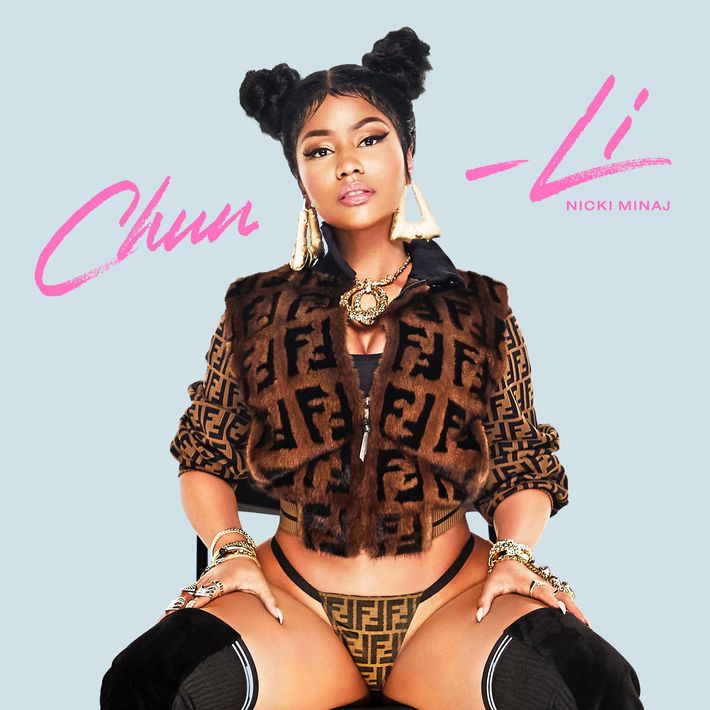
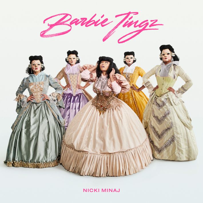
Release Date: April 12, 2018.
Designer: Duong Nguyen. Perez: “Right now, in the industry, he’s the go-to for handwritten calligraphy because he’s prodigious with the speed with which he produces.”
Deadline: Four hours. Perez: “The text rolled in at two o’clock in the morning my time because they’re based elsewhere and then I worked until I delivered it at 6 a.m.”
References: Handwritten styles from the ’80s, Barbie, Chun-Li from Street Fighter.
Perez: “The imagery we were provided was very playful and somewhat kinetic in nature so I instantly gravitated towards a more handwritten calligraphy style type that fit the aesthetic of this playfulness.”
Marsh: “Well, Nicki is a Barbie queen, you know? I see the covers of Queen, ‘Barbie Tingz’ and ‘Chun-Li’ as Nicki portraying queens from different eras. ‘Chun-Li’ has Fendi for the modern queen with the bad-bitch warrior side. ‘Barbie Tingz’ is referencing something a lot older, Victorian almost.”
Perez: And Queen is barbarian warrior, somewhere between Egypt and Genghis Khan.
“Rich Sex”
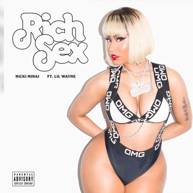
Release Date: June 11, 2018.
Designer: Hard Graphic Design.
Deadline: Three hours. Perez: “It’s based off another type form, but it’s been customized. Under some of the tighter deadlines, we do start with a base or influence and we customize from there.”
References: ’70s Soul Train.
Perez: “We got a call from her manager with the title, that’s it. It was almost like a Marvin Gaye track. I’m like, it could be. On 10 percent of the tracks we work on I’m lucky to hear the music. We didn’t even get a photo initially for this one, so we designed an entire cover. We were supplied the photo after, so we switched that in, but the typography worked so we kept it.”
“Bed”
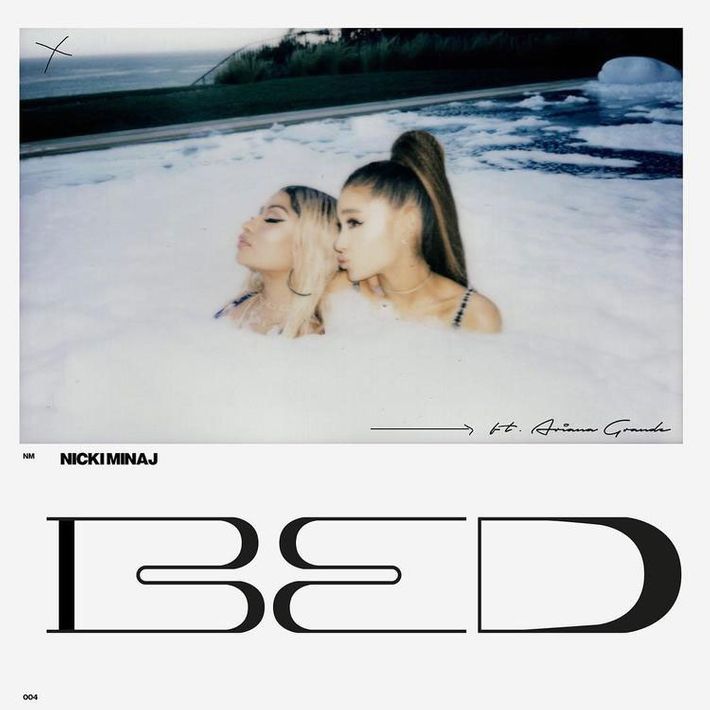
Release Date: June 14, 2018.
Designer: Hard Graphic Design.
Deadline: One day.
References: Fashion editorials and Polaroids from the ’80s and ’90s.
Marsh: “You take a Polaroid, fold it over, write on the back of it. That type of era. I chose handwritten fonts, weighed them out, and had Jon Bland of Hard Design make custom typography. He also came up with the small NM. I had sent him a reference of a different album I worked on that had the artist’s name really small and he abbreviated it to NM here. We liked it.”
Queen
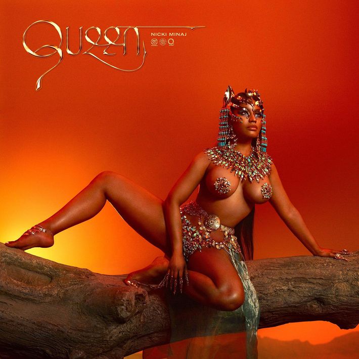
Release Date: June 7, 2018, even though the album’s coming in August.
Designer: Assistant art direction and type design: Katie McIntyre, Type drawing: Allen Chiu, Design: Gucci Maze, Support Design: Jacob Wise, Jordan Marks, and Hedi Xant, Research: Dmitry Larionov.
Deadline: Two months. Perez: “We had a last deadline and a date when it was going to come out, but Nicki just posted it early. She thought it was done and it was out. We were maybe going to do some minor tweaks that only someone working behind the scenes and staring at this for hours would notice, but when we hand in a hi-res file, we know it’s up to the artist when to release it. The labels have their own deadlines, but really when the artist gets it, and it’s a final product, anything goes, really. Anytime you send over a version everything has to be perfect because this could be a final.”
References: African, Indian, and Hindu culture; Nicki’s curves.
Perez: “We did a deep dive, went to the RISD library, and pulled references on typography, calligraphy, art, and sculpture. We had this really broad moodboard of different facets of these cultures, whether it was a painting or an old scroll or what have you. We did a lot of research and the script came from that.”
Marsh: “Nicki is very feminine and she responds to the prototypically feminine, so we thought she would respond to curvilinear lines. We were looking at a lot of things that felt maternal, like reproductive systems, and I found this old cookware. We were also bringing in weaponry and how ancient weaponry was formed to put an edgy spin on it too. It was about making something that felt like her body shape, but also had that edge.”
Perez: “The queen, the conqueror, the warrior goddess. Feminine, yet strong and aggressive when she needs to be. It’s a bit all encompassing. Mother Nature.”
Marsh: “We created earlier versions of this cover based on custom letterforms that were drenched in pink and different colors and textures, but in the end she wanted to go with an image of herself, which we agreed with. If you blow up the logo and look at those three little symbols underneath, there’s an ‘M’ in a circle and that was the foundation for one of the earlier covers. We adapted it for the Queen typography and in the end we were able to include it at only a few pixels wide.”
Perez: “We’re always trying to tie everything together with little nuances, so you can establish a nuance and build it out to this whole world. People will see little gems in different places and feel more of a connection from one thing to another.”
Marsh: “The ‘Chun-Li’ merch ended up being finalized before the album and we had a little throwing blade on it. We adapted that concept of a blade and put it on the album as another one of those small symbols. It was an interesting case where the merch informed the album art.”
NickiHendrixx Tour Poster
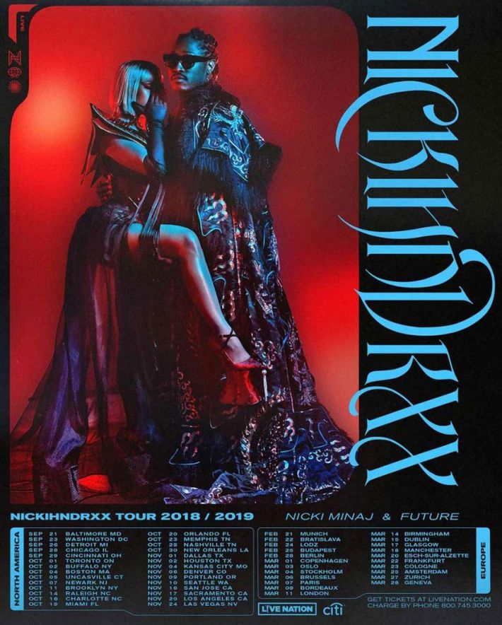
Release date: June 11, 2018.
Deadline: One day. Perez: “I was up until 4 or 5 in the morning texting with Nicki and her team.”
Designer: Hard Graphic Design.
References: Perez: “We wanted a balance of masculine and feminine. We had to please two artists on a co-tour so it was finding a balance between the two and having it aggressive and exciting at the same time, as a tour should be, and something that would look good on not just print, but merch.”
Marsh: “A problematic thing with the tour poster is the amount of dates and text and making sure that’s all legible and clean-looking. Larger artists can get away with just a photo so it doesn’t matter if you can’t read Nicki Minaj or Future because we all already know who they are. Kanye never puts text or his name on his albums or merch because you all already know.”
Perez: “I think the original font that we created works better on merch than on a poster. It’s a low-legibility factor and since it’s going vertical it may be a little hard to read on the poster, but it has a unique personality that lends itself to carry on into merch. It’s more fun and playful than a regular serif of sans-serif typeface. It’s been customized to the point where it has its own unique personality that people can relate to.”