

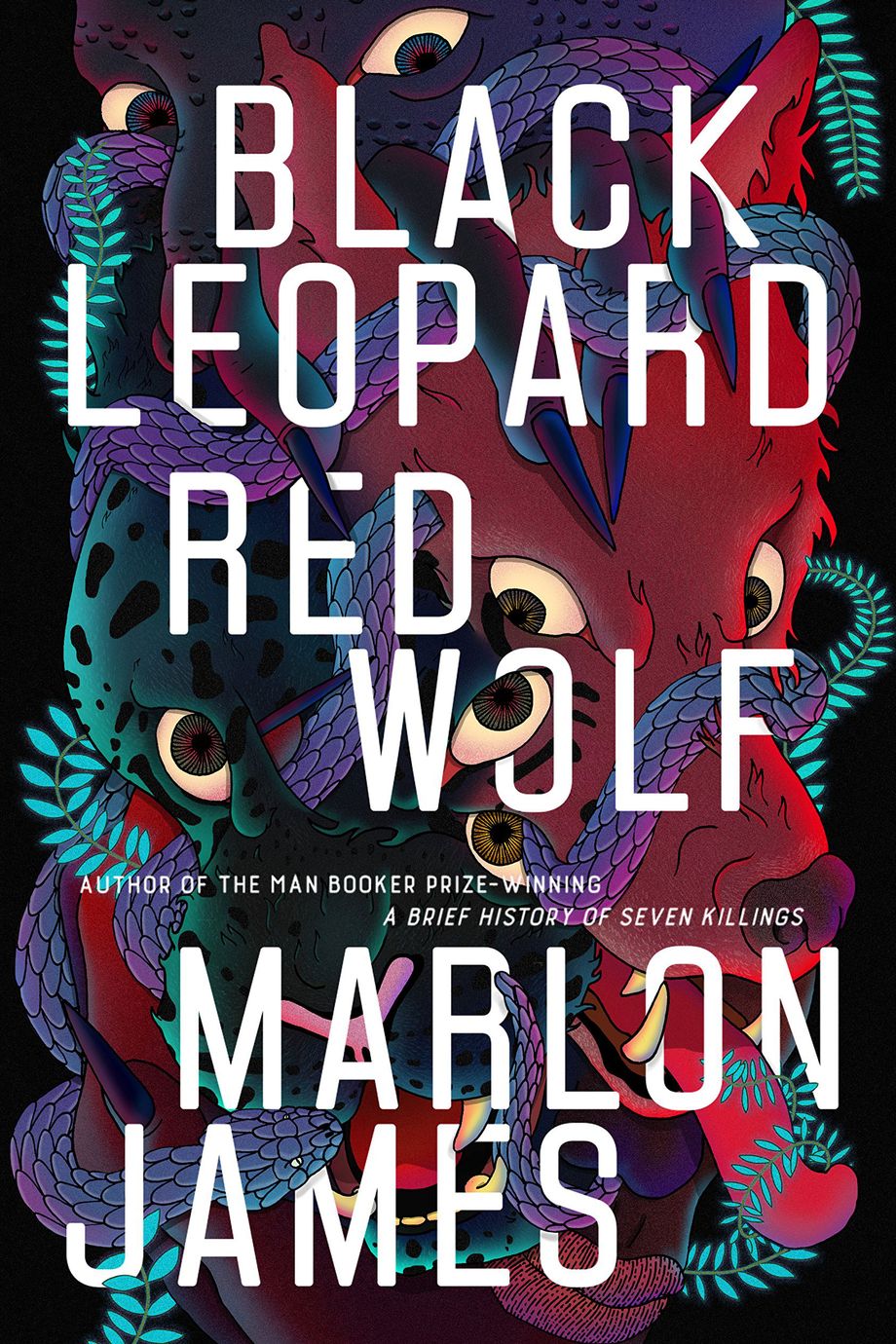
If you’re looking for the most anticipated books of 2019, chances are your search will start with Google and end at Amazon. Chances are even better that one book cover will consistently jump off the screen: Marlon James’s Black Leopard, Red Wolf, its graphic white title entwining with a writhing, jewel-toned print of a shape-shifting beast. This first book in the Booker Prize–winning author’s Dark Star trilogy, a queer, Afrofuturist fantasy series, has already been called the “African Game of Thrones.” (Another tagline: the literary Black Panther.) It’s clearly being positioned by publishers and booksellers as a cultural icon, with a blazing cover to match.
Scroll on through the best-of lists and other titles will pop just as loudly: The title of Pitchaya Sudbanthad’s Bangkok Wakes to Rain gleams in gold letters over a drippy green abstraction of leaves. Helen Oyeyemi’s Ginger Bread shouts in bold yellow against a lightly ombré coral backdrop, its plane broken by a black crow grasping a gleaming tangerine. And Kristen Arnett’s Mostly Dead Things features a twisted, hand-drawn flamingo on a field of avocado green, with the title scrawled over it in what appears to be a fat white sharpie.
None of these titles is available yet, but anywhere you find them online will likely direct you to preorder on Amazon. [Ed.: Guilty.] In fact, their covers are designed to ensure that you will. At a time when half of all book purchases in the U.S. are made on Amazon — and many of those on mobile — the first job of a book cover, after gesturing at the content inside, is to look great in miniature. That means that where fine details once thrived, splashy prints have taken over, grounding text that’s sturdy enough to be deciphered on screens ranging from medium to miniscule.
If books have design eras, we’re in an age of statement wallpaper and fatty text. We have the internet to thank — and not just the interface but the economy that’s evolved around it. From the leather-bound volumes of old to lurid mass-market paperbacks, book covers were never designed in a vacuum. Their presentation had everything to do with the way books were made, where and how and to whom they were sold. And when you look at book covers right now, what you’ll see blaring back at you, bold and dazzling, is a highly competitive marketing landscape dominated by online retail, social media, and their curiously symbiotic rival, the resurgent independent bookstore.
Since the beginning of print, covers have reflected the aesthetics, and the technologies, of their day. The 1950s, for example, saw the debut of Penguin’s classic vertical-grid convention in paperback design, in conjunction with the new popularity of books bound in paper. Into the ’60s, the advent of the Polaroid introduced realist images to the book cover, and the ’70s brought free-form design and psychedelia.
Over the next 20 years, as Gregg Kulick, an art director at Little, Brown, recalls, the focus turned to more intricate distinctions. “If you look at the AIGA 50 design competition winners from the ’90s,” says Kulick, “the type is so much smaller and more delicate because people’s interface with a book was at a bookstore.” And then came the web. “Now you see more of a large-type interplay with a texture behind it, because that’s what plays on a little thumbnail on the internet.”

Today’s market pressures extend far beyond decreasing the viewable size of the product. Since 2013, two things have happened in publishing: sales of print books have increased by nearly 11 percent, and at the same time, the industry has lost about a billion dollars in revenue, thanks to Amazon’s undercutting of book prices. This leaves publishers with a killer combination of higher stakes and fewer resources, which leads in turn to safer choices. “People are taking a lot fewer risks than they used to,” says Kulick. They opt for designs they know will work. Hence, our current trend.
It’s also never been harder to know exactly what does work in book marketing. Because publishers don’t sell directly to consumers, instead funneling copies through Amazon, Barnes & Noble, and independent bookstores, they’re unable to gather much data on purchasing patterns. Amazon, for example, only shares titles’ daily sales numbers — a crude metric at best.
Of course, Amazon mines its own data intensively, refining search algorithms that are opaque to readers and publishers alike. (Its expansion into physical retail is widely regarded as just another data-collection tool.) And on its own proprietary reading device, the Kindle (another trove of data), the cover almost ceases to matter at all.
Left with blunt tools and fuzzy math, book marketing and design departments resort to instinct and look for ways to produce the most visible proof of concept: publicity. And where do we go for publicity in this age of tech disruption? Social media.
Books that are designed to render well on digital screens also look great on social. Let’s return for a moment to our avatar of great publicity, Marlon James. Black Leopard, Red Wolf’s publisher, Riverhead Books, has an Instagram account so pristine, so archetypical of contemporary design, that you’d think its jackets were all designed explicitly to sit there and rack up likes — likes that ideally convert to sales.
“Instagram is a major tool now in ginning up excitement that we used to see in print magazines,” says Emma Straub, Riverhead-published author and owner of the Brooklyn bookstore Books Are Magic.
She’s referring, of course, to the latte-laden still lifes that influencers post to brag about receiving an advance copy of a book, or the artful arrangements they use to signify literate lifestyles arranged in bold colors.
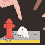
A week before its release, Black Leopard, Red Wolf already appears on Instagram in popular poses — atop a spectrum of pebbles, nestled in bed sheets next to fuzzy dogs, and perched beside an array of foamy drinks, building name recognition among fantasy lovers before it goes on sale.
It’s a classic rule of marketing: The more touch points a potential reader has with a particular book — the more times they see a cover posted by an account they trust — the more likely they are to buy. Consider a fairly recent Instagram success. “Alex Chee’s How to Write an Autobiographical Novel is a book that people posted pictures of so many times that word-of-mouth became word-of-eye,” says Straub. “Not only would someone come in and say, ‘I’ve heard about this book,’ but they’d know what it looked like.”
In a marriage of irony and logic, a book that pops in a filtered miniature Instagram still life can declare its presence just as loudly from across the room, particularly in the boutique environment of the modern independent bookstore. In the wake of Barnes & Noble’s decline, as a certain type of consumer has grown to fetishize the local and the IRL, indie bookshops have enjoyed a surprising resurgence. Their ranks increased by 35 percent between 2009 and 2015, according to the American Booksellers Association, enriching the U.S. with over 2,300 independent bookstores today.
Within their communities, both in person and online, these stores function as the ultimate literary influencers, providing an appealing space and expert guidance. They also, as often as not, re-create the idiosyncratic touches — the homey flourishes and nostalgic signage — of visually driven social media. Inevitably, customers are as likely to photograph the shelves as they are to read what’s on them. Who could resist capturing this curated, analog utopia?
So we find ourselves in the recursive modern world of bookselling, tumbling through an endless loop from the physical to digital and back again. Confusing as that loop may be, it’s an apt summation of this moment in design.

People like the way things look on the internet: idealized, controlled, insulated from the chaos of reality. So why shouldn’t our everyday objects — and particularly our books, where we’ve always turned for escape — give us that same feeling in person? Helen Yentus, the Riverhead art director responsible for most of the covers mentioned here, says that today’s cover art needs to be ambidextrous. “We have to make sure what we make works equally well in both settings,” she says. “If you miss the details, you’re still getting an interesting, captivating visual, but if you’re giving it a closer look, the details are there.”
In fact, we might now be in the second wave of internet-forward book design. This year’s patterns are more pictorial than the simple geometries of, say, R.O. Kwon’s The Incendiaries or Meg Wolitzer’s The Female Persuasion. They also double down on the interaction between text and image, breaking the plane of the text in ways that can only be fully appreciated through physical contact. On the rich, matte cover of Black Leopard, Red Wolf, one of the shape-shifter’s eyes loops through the second O, and a talon creeps out from under the K. The letters in Bangkok Wakes to Rain are overlapped by the stylized drips falling across the cover’s forested background. These details feel like rewards for those committed to reading on paper; Easter eggs hidden throughout the bookstore.
The delight of the in-person experience doesn’t change the reality that most people will continue to buy their books online. But as our physical and digital worlds converge, books — or at least their covers — are finding a way to straddle both. You can have your eye candy and read it, too.

