Here at New York Magazine, we think of Milton Glaser, one of the 20th century’s greatest graphic designers, in perhaps slightly parochial terms: He and the editor Clay Felker co-founded New York in 1968, and Glaser and his team designed every issue through the end of 1976. The logo you see on our cover and homepage comes directly from his hand, and has seen only the tiniest of changes over the decades. But even we have to admit that his career has been far more varied and broad, ranging from beer branding (Brooklyn Brewery!) to one of the most recognizable taglines in history, I ♥ NY. And because he’s so good at the singular punchy image — whether magazine cover or logotype or slogan — much of his best work takes the form of posters, which he’s just collected in Milton Glaser Posters, a handsome little brick-size book that’s now out from Abrams. It covers his career from 1962 up to the present. Seven of the posters from its pages appear below, chosen for no reason more complex than, “We think they’re great.” Feel free to go through the other 420 and argue with us in the comments.
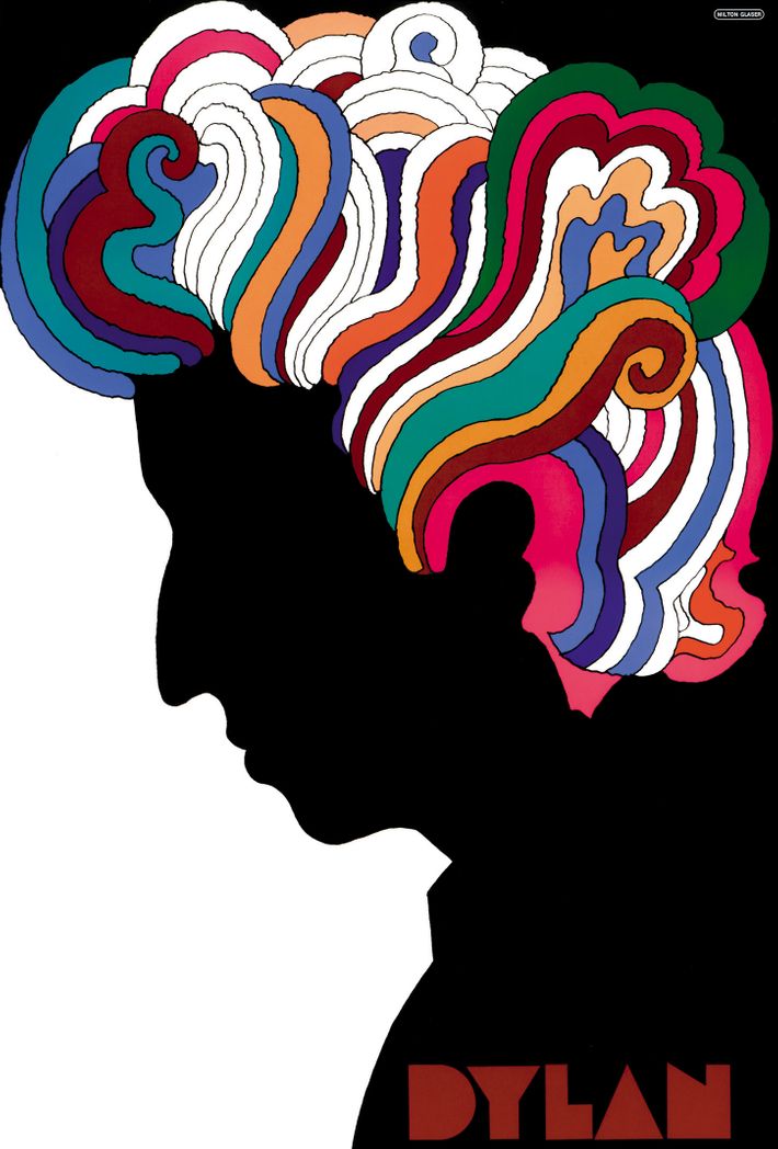
Dylan (1967)
This is the work for which Glaser-as-poster-designer is best known, partly because it was included, folded up, with tens of thousands of LP copies of Bob Dylan’s Greatest Hits. As such, it ended up on every dorm-room wall of the late ’60s. The inspiration, he notes, was a Marcel Duchamp self-portrait in silhouette. “When I first encountered the Duchamp,” Glaser explains puckishly in the book, “I filed it away in my brain to use at some future time … The difference between influence and plagiarism is not always clear.”
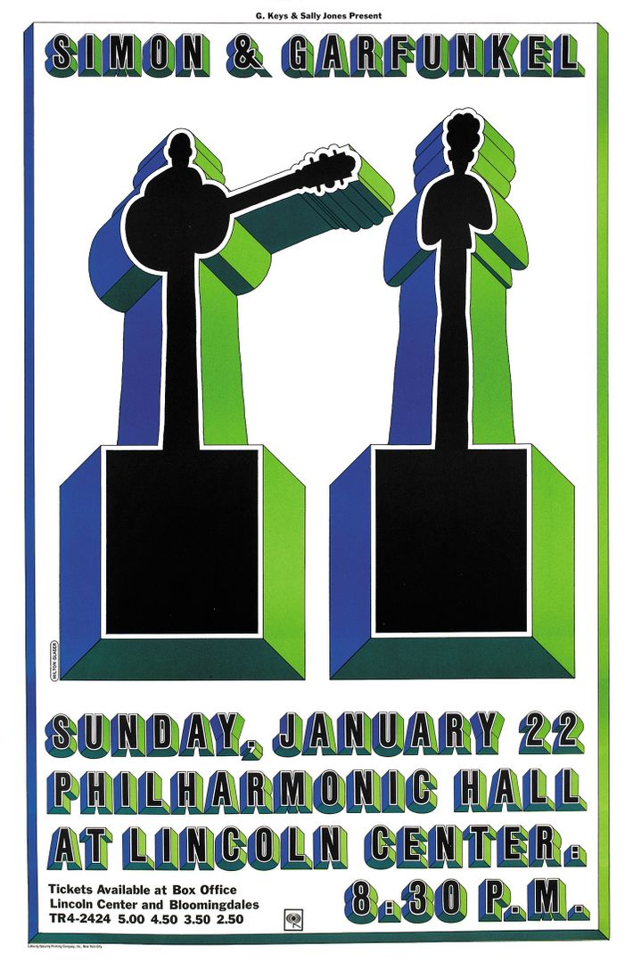
Simon & Garfunkel (1967)
The typeface, called Baby Fat and popular for book covers in the 1970s, was itself a Glaser design; here he turned the two performers into a couple of extra bits of typography. Amazingly (or maybe inevitably) Garfunkel’s hair is immediately recognizable.
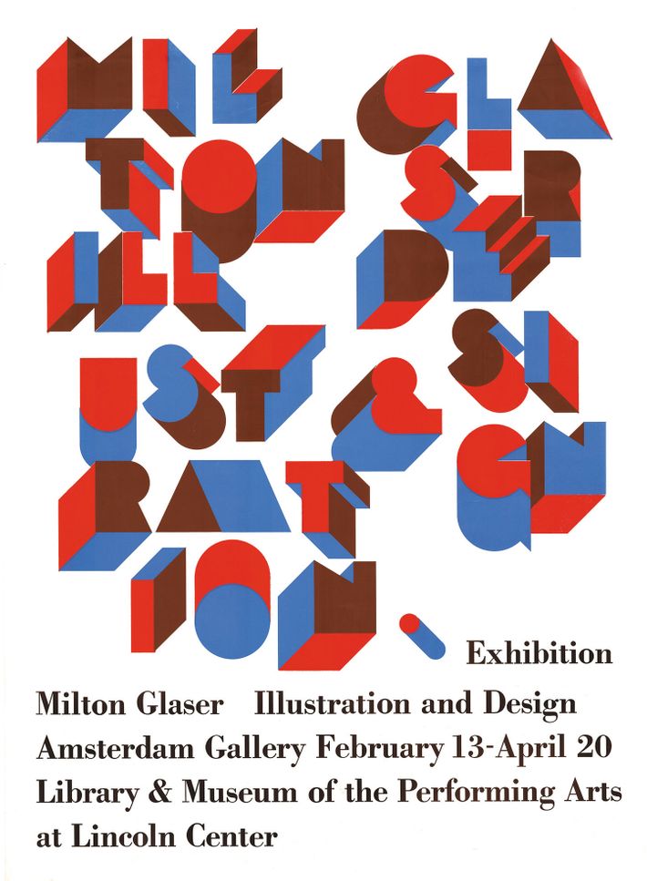
Milton Glaser Illustration and Design (1968)
Another Glaser typeface, this one called Baby Teeth, proves that letterforms driven right up to — but not over — the edge of abstraction can also be quite readable. (Same as on the Dylan poster above, by the way.)
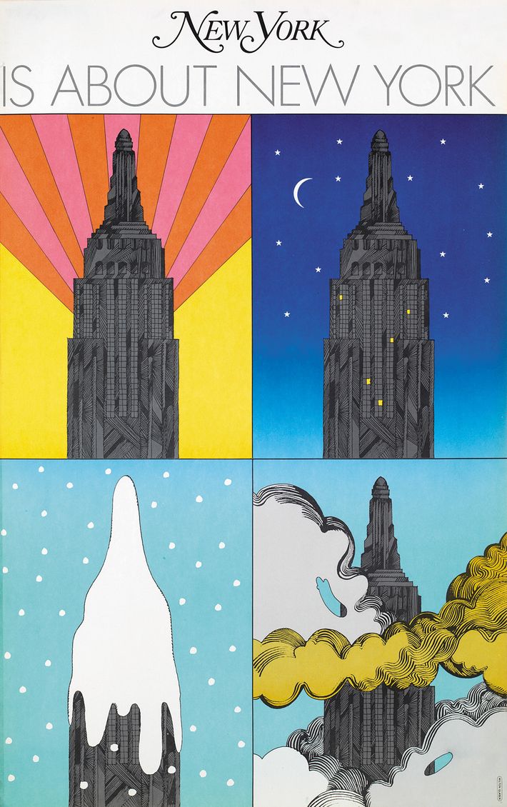
New York Is About New York (1967)
For the launch of New York Magazine — which was in its early years run out of Glaser’s building on 32nd Street, a very short walk from the Empire State Building — Glaser drew the neighbors. The backgrounds are super simple, pared down to the essentials, whereas the gray Art Deco details on the building are enhanced with fanciful cross-hatching.
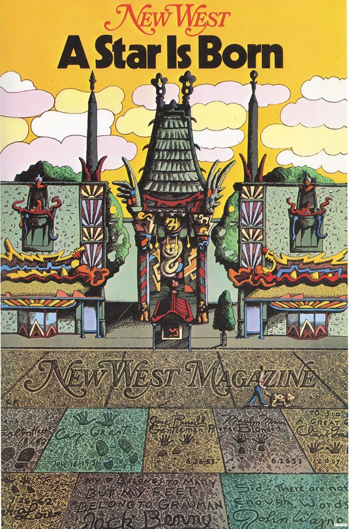
New West: A Star Is Born (1976)
Eight years after the first launch, Felker and Glaser began to publish a West Coast sibling to their magazine, called New West, and Glaser once again made a poster to launch it. The image, of Grauman’s Chinese Theatre and its concrete sidewalk footprints, was durable and successful. The magazine itself was pretty good, but it lost a fortune and was renamed California in 1981, then closed down for good a few years later.
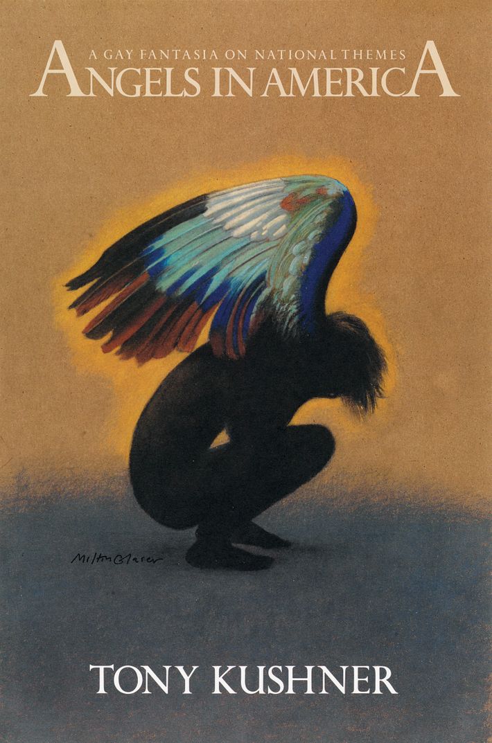
Angels in America (1993)
The defining play of its generation also had a killer poster. This is, Glaser points out, another one that borrows from the fine-art world: The iridescent wing takes inspiration from a drawing by Albrecht Dürer.
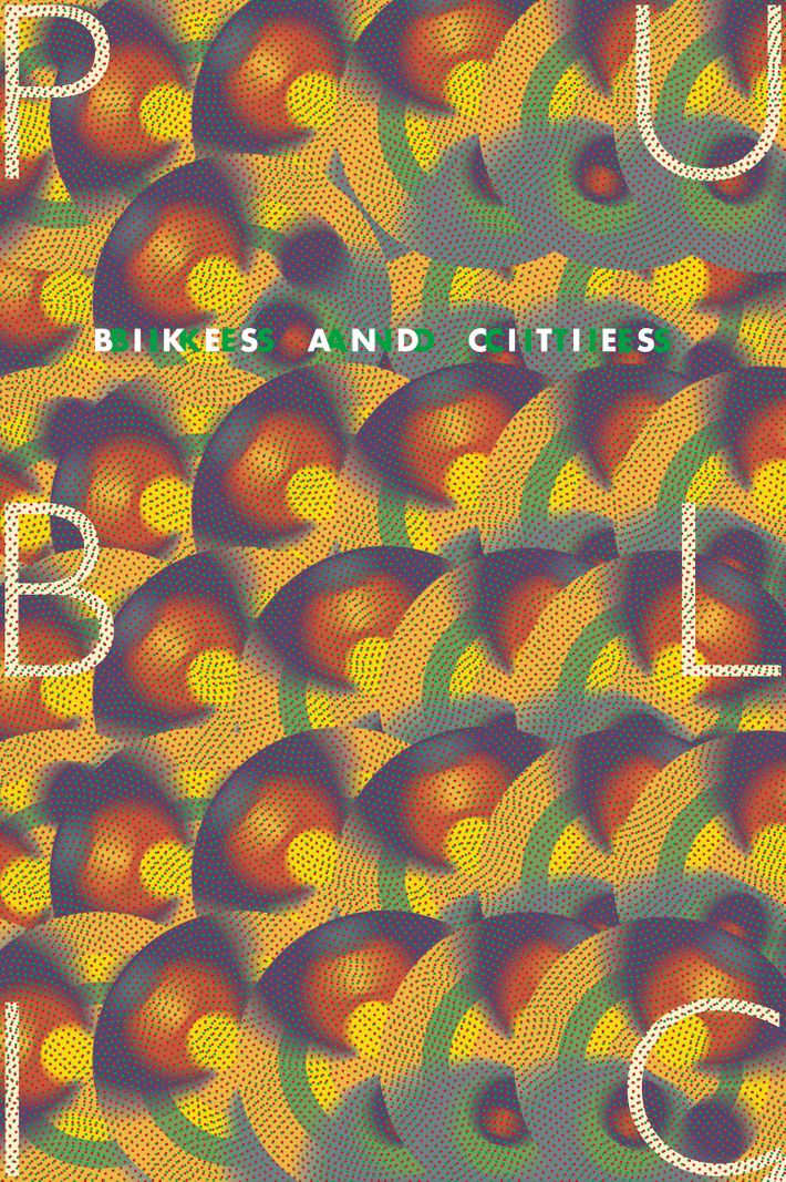
Bikes and Cities (2012)
As close to pure abstraction as any in this book, Glaser’s poster for a bike-advocacy group evokes machine-turned metal finishes, speed, traffic lights, and (of course) the spinning wheels of the bicycles themselves. Take off the type and it would be staggeringly great, trippy wallpaper.